It's going to be another piece of stunning art from you. I can already tell.

Is there any way you could make the TT stand out more. I mean I like it, and I can read it fine. But with both the sky being light, and the TT also light it doesn't pop out at me as much as your titles usually do. Hope that makes sense.
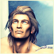
There is something about the top half that I'm not totally certain about. I mean the front really does look fantastic. but... I think the problem I'm having is that while the bottom half is awesome.. So much going on with the characters, that cool dome, and the jungle. Yet the top half is a bit empty, not as much going on. I realize you probably don't want to over do it. Otherwise it will be busy, and distracting. I don't know, maybe it's just me. Then again, you probably aren't finished with the front, and if you end up adding some actors names, or something it will probably fill the front out nicely. So just ignore me, and I will wait and see what you come up with.

Sorry. I think my creativeness is on break right now. lol. I'm sorry I don't have any suggestions for you.


 Viewed 1303 times")