Current Contest Banner


EFX Subscriptions

Closed WIPs

Archive for closed Work In Progress threads, retained for reference.

Scarface

Postby Nickaberdeen » Jul Wed 10, 2019 4:34 am

So I had quite a lot of fun with the last wip I did so decided I'd go again. I just bought a copy of Scarface off ebay so figured that would be a good one to go with.

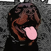
I had a look around for some artwork that was a little different from the standard options and managed to find one I liked that got me to imagine a design so it's just about trying to get that image in my head into a design. I get the feeling it's going to be tricky to get the artwork on the back to match it but that is a problem for later.

So let's get started. I have got stuck in a little (masked out the image I want to use and put a basic background and layout into place) but will probably tweak things as I go along, as always if anyone has any suggestions on what they think I could do to improve it feel free to speak up.

So here is what I have so far:


I have included the spine as well as the front because as I was making the front it overlapped slightly and I quite liked it so tweaked it a little to cover the region 2 icons.

I will want to alter the red images later, maybe add some texture or something so it doesnt look flat but wanted it in there while it was in my head.

At the moment I am using a justice league font for the title as I quite liked the straight edges but it will probably get changed (I did look for the scarface font but havent found anything close yet and I do like the squareness of the font so not sure what I'm going to do yet, we'll see).
Image
User avatar
Nickaberdeen
Exclusive Artist
Topic author
Posts: 324
Topics: 53
CoverArt: 314
Joined: August 4, 2017
Medals: 1
2019 Rising Star Designer (1)

Re: Scarface

Postby bankska22 » Jul Wed 10, 2019 7:51 am

Good start though I prefer to see the title something other than white. I do like your start.
Image
User avatar
bankska22
Moderator
#1 Dallas Cowboy's Fan!
Posts: 7064
Topics: 977
CoverArt: 1917
Resources: 24
Joined: February 20, 2011
Medals: 10
COTM January 2023 (1)2021 April Cover Contest (1)2020 August Cover Contest (1)2020 May Cover Contest (1)
EFX 5K Post Club (1)2019 June Cover Contest (1)COTM March 2019 (1)2014 Action Label Design Comp (1)

Re: Scarface

Postby ctaulbee » Jul Wed 10, 2019 10:13 am

Look like a great start Nick, I'm not keen on the white title either. :)
ImageImageImageImageImageImageImageImage
My Gallery  •  Please leave a vote and short comment if you download my work, thanks.  •  My Criterion Collection
User avatar
ctaulbee
Super Administrator
Hand Me The Sledgehammer... I'll Fix It!
Posts: 16188
Topics: 1091
CoverArt: 3412
Resources: 4628
Joined: November 8, 2005
Occupation: The Devil's Hand
Location: Realm of Nightmares
Medals: 56
2021 Cover of The Year (1)COTM March 2021 (1)COTM January 2021 (1)COTM November 2020 (1)
COTM July 2020 (1)COTM February 2020 (1)COTM January 2020 (1)COTM December 2019 (1)

Re: Scarface

Postby Nickaberdeen » Jul Wed 10, 2019 1:04 pm

funnily enough the image that was in my head was a black title but i ended up changing it as it didnt look as good when i actually did it, thought the white looked better (on the front mainly). here is what i originally envisioned:

Image
User avatar
Nickaberdeen
Exclusive Artist
Topic author
Posts: 324
Topics: 53
CoverArt: 314
Joined: August 4, 2017
Medals: 1
2019 Rising Star Designer (1)

Re: Scarface

Postby topmeasure » Jul Wed 10, 2019 1:19 pm

Black is much better, nice start Nick.
User avatar
topmeasure
Forum Director
I Give You One Like!
Posts: 8070
Topics: 833
CoverArt: 675
Resources: 12
Joined: August 22, 2012
Occupation: Self employed
Location: Sarasota, Fl.
Medals: 6
EFX Forum Champ 2022 (1)EFX Forum Champ 2021 (1)EFX Froum Champ 2020 (1)EFX 5K Post Club (1)
EFX Froum Champ 2019 (1)EFX Froum Champ 2018 (1)

Re: Scarface

Postby ctaulbee » Jul Wed 10, 2019 1:43 pm

Might stroke the black with a little white (sort of invert what you had before) and see how it works but I like the black better. :D
ImageImageImageImageImageImageImageImage
My Gallery  •  Please leave a vote and short comment if you download my work, thanks.  •  My Criterion Collection
User avatar
ctaulbee
Super Administrator
Hand Me The Sledgehammer... I'll Fix It!
Posts: 16188
Topics: 1091
CoverArt: 3412
Resources: 4628
Joined: November 8, 2005
Occupation: The Devil's Hand
Location: Realm of Nightmares
Medals: 56
2021 Cover of The Year (1)COTM March 2021 (1)COTM January 2021 (1)COTM November 2020 (1)
COTM July 2020 (1)COTM February 2020 (1)COTM January 2020 (1)COTM December 2019 (1)

Re: Scarface

Postby tmscrapbook » Jul Wed 10, 2019 2:00 pm

Black title is much better. GREAT start, Nick :)
Image
User avatar
tmscrapbook
Site Moderator
#1 Seattle Seahawks Fan
Posts: 3210
Topics: 324
CoverArt: 19575
Joined: December 18, 2010
Occupation: Retired Mathematics teacher
Location: Washington State, USA
Medals: 12
Contributor Of The Year 2022 (1)35,000 Downloads (1)25,000 Downloads (1)15,000 Downloads (1)
Contributor Of The Year 2021 (1)Contributor Of The Year 2020 (1)EFX Camp Counselor 2020 (1)Contributor Of The Year 2018 (1)

Re: Scarface

Postby bankska22 » Jul Wed 10, 2019 4:56 pm

Looking good.
Image
User avatar
bankska22
Moderator
#1 Dallas Cowboy's Fan!
Posts: 7064
Topics: 977
CoverArt: 1917
Resources: 24
Joined: February 20, 2011
Medals: 10
COTM January 2023 (1)2021 April Cover Contest (1)2020 August Cover Contest (1)2020 May Cover Contest (1)
EFX 5K Post Club (1)2019 June Cover Contest (1)COTM March 2019 (1)2014 Action Label Design Comp (1)

Re: Scarface

Postby Nickaberdeen » Jul Wed 10, 2019 7:24 pm

a little update, i have added in the legals and screenshots (i think possibly two of them have a bit of a pink tinge to them so will hopefully try and figure out how to compensate to remove that, if anyone has any pointers for this thatd be great). now to find some inspiration for the back.

Image
User avatar
Nickaberdeen
Exclusive Artist
Topic author
Posts: 324
Topics: 53
CoverArt: 314
Joined: August 4, 2017
Medals: 1
2019 Rising Star Designer (1)

Re: Scarface

Postby bankska22 » Jul Wed 10, 2019 7:43 pm

Coming along fine.
Image
User avatar
bankska22
Moderator
#1 Dallas Cowboy's Fan!
Posts: 7064
Topics: 977
CoverArt: 1917
Resources: 24
Joined: February 20, 2011
Medals: 10
COTM January 2023 (1)2021 April Cover Contest (1)2020 August Cover Contest (1)2020 May Cover Contest (1)
EFX 5K Post Club (1)2019 June Cover Contest (1)COTM March 2019 (1)2014 Action Label Design Comp (1)

Re: Scarface

Postby VincentLupo » Jul Wed 10, 2019 9:15 pm

Great job so far!
Image
User avatar
VincentLupo
Moderator
The Panda Moderator
Posts: 9791
Topics: 7
CoverArt: 2
Joined: February 21, 2008
Location: Olympia, Wa USA
Medals: 3
EFX 5K Post Club (1)Pandapedia Official Founder (1)Official Panda Moderator (1)

Re: Scarface

Postby sauron » Jul Thu 11, 2019 3:07 pm

Looking good, i’m not keen on the font used on the TT but the black isn’t working in my opinion, how about using the colour of Al Pacino skin?
User avatar
sauron
VIP Subscriber
Build me a cover worthy of Mordor.
Posts: 893
Topics: 7
CoverArt: 27
Resources: 9
Joined: September 1, 2007
Location: UK

Re: Scarface

Postby Nickaberdeen » Jul Fri 12, 2019 5:55 am

sauron wrote:Looking good, i’m not keen on the font used on the TT but the black isn’t working in my opinion, how about using the colour of Al Pacino skin?


i will be going back to the title soon. have been looking for something closer to the scarface font but havent found what i want yet.

have been working on finishing off the back, still not quite there yet with the image, getting there slowly but it is proving quite tricky.

here is where i am at currently:

Image
User avatar
Nickaberdeen
Exclusive Artist
Topic author
Posts: 324
Topics: 53
CoverArt: 314
Joined: August 4, 2017
Medals: 1
2019 Rising Star Designer (1)

Re: Scarface

Postby topmeasure » Jul Fri 12, 2019 6:37 am

Looks great Nick.
User avatar
topmeasure
Forum Director
I Give You One Like!
Posts: 8070
Topics: 833
CoverArt: 675
Resources: 12
Joined: August 22, 2012
Occupation: Self employed
Location: Sarasota, Fl.
Medals: 6
EFX Forum Champ 2022 (1)EFX Forum Champ 2021 (1)EFX Froum Champ 2020 (1)EFX 5K Post Club (1)
EFX Froum Champ 2019 (1)EFX Froum Champ 2018 (1)

Re: Scarface

Postby Nickaberdeen » Jul Fri 12, 2019 9:27 am

so i have changed the title to the scarface font, altered the screenshots to reduce the pink tint and have worked more on the back image. altering the image has been driving me a little nuts so might have a short break from it and come back to it later, im not 100% happy with it (but not sure how improve it at the moment), might also look at altering the jacket but not sure yet.

Image
User avatar
Nickaberdeen
Exclusive Artist
Topic author
Posts: 324
Topics: 53
CoverArt: 314
Joined: August 4, 2017
Medals: 1
2019 Rising Star Designer (1)

Re: Scarface

Postby sauron » Jul Fri 12, 2019 2:13 pm

The TT font is much better now! Personally the black doesn’t work.

The back layout is good! I would just play around with the synopsis as it’s a bit all over the place at the moment, the synopsis is too broken up and there’s no real focal point for the text.. play with thicker and bigger fonts for the tag line/quote to make it easily distinguishable what’s what :)
User avatar
sauron
VIP Subscriber
Build me a cover worthy of Mordor.
Posts: 893
Topics: 7
CoverArt: 27
Resources: 9
Joined: September 1, 2007
Location: UK

Re: Scarface

Postby ctaulbee » Jul Fri 12, 2019 2:38 pm

Your back and front images are very different in that one is light the other is dark, so would be very hard to make them look much alike, beyond what you have already done I should add.

That said you could bring up the white highlights on the back image some might make them a little closer, it's not bad though.

:D


ImageImageImageImageImageImageImageImage
My Gallery  •  Please leave a vote and short comment if you download my work, thanks.  •  My Criterion Collection
User avatar
ctaulbee
Super Administrator
Hand Me The Sledgehammer... I'll Fix It!
Posts: 16188
Topics: 1091
CoverArt: 3412
Resources: 4628
Joined: November 8, 2005
Occupation: The Devil's Hand
Location: Realm of Nightmares
Medals: 56
2021 Cover of The Year (1)COTM March 2021 (1)COTM January 2021 (1)COTM November 2020 (1)
COTM July 2020 (1)COTM February 2020 (1)COTM January 2020 (1)COTM December 2019 (1)

Re: Scarface

Postby Nickaberdeen » Jul Fri 12, 2019 9:05 pm

sauron wrote:Personally the black doesn’t work.


i tried other colours (like the skin colour etc) but none of them looked very good, personally i thought the white version looked the best but the consensus was that black was a better option. i also tried putting something behind the title to make it look better but that didnt really work out. the next best option was to invert it like CT suggested so will include that in the next update to check out.

sauron wrote:play with thicker and bigger fonts for the tag line/quote to make it easily distinguishable what’s what :)


not sure what you mean, the tag line and quote are both in larger thicker fonts than the synopsis, 4 points and 2 points larger respectively and in a different colour. can you clarify?

ctaulbee wrote:you could bring up the white highlights on the back image some


how do i do this? i assume its not done just through the levels option.

i thought about adding a little grey colouring to the jacket to match the front more, i think itll be quite tricky though so will go back to test it out when i get a chance.
Image
User avatar
Nickaberdeen
Exclusive Artist
Topic author
Posts: 324
Topics: 53
CoverArt: 314
Joined: August 4, 2017
Medals: 1
2019 Rising Star Designer (1)

Re: Scarface

Postby ctaulbee » Jul Sat 13, 2019 1:35 am

Several ways to do it, you could use a luminosity channel mask to select the very bright parts on the back image then blow them out to white with any number of methods.

One other thing you could do too is mask his left side on the back and do away with the black on black, instead make the background behind him the red, then you will have contrast definition around his head and shoulder.
ImageImageImageImageImageImageImageImage
My Gallery  •  Please leave a vote and short comment if you download my work, thanks.  •  My Criterion Collection
User avatar
ctaulbee
Super Administrator
Hand Me The Sledgehammer... I'll Fix It!
Posts: 16188
Topics: 1091
CoverArt: 3412
Resources: 4628
Joined: November 8, 2005
Occupation: The Devil's Hand
Location: Realm of Nightmares
Medals: 56
2021 Cover of The Year (1)COTM March 2021 (1)COTM January 2021 (1)COTM November 2020 (1)
COTM July 2020 (1)COTM February 2020 (1)COTM January 2020 (1)COTM December 2019 (1)

Re: Scarface

Postby Nickaberdeen » Jul Sat 13, 2019 3:42 am

technically i have him masked out of background (did it at one point to see if it looked better).

Masked out and white outline round title:


Red strip and skin coloured title:


ctaulbee wrote:[size=125]Several ways to do it, you could use a luminosity channel mask to select the very bright parts on the back image then blow them out to white with any number of methods.


is that what you did to the colouring of his face? im curious as your version looked much closer to what i was aiming for.  :D
Image
User avatar
Nickaberdeen
Exclusive Artist
Topic author
Posts: 324
Topics: 53
CoverArt: 314
Joined: August 4, 2017
Medals: 1
2019 Rising Star Designer (1)

Re: Scarface

Postby ctaulbee » Jul Sat 13, 2019 10:51 am

I prefer the one with the red behind him and the Black title.

I masked him off and used a Topaz Labs plugin to pump up the whites, Topaz software is not free though.

The one I used was Topaz Labs - Adjust 5 - Vibrant Collection - Detail - Strong II

https://topazlabs.com/


The PSD for the above with the adjusted layer in it (it won't show you anything though as it's just a pixel layer output from Topaz).

ScarfaceEX.rar
(2.01 MiB) Downloaded 1 time
ImageImageImageImageImageImageImageImage
My Gallery  •  Please leave a vote and short comment if you download my work, thanks.  •  My Criterion Collection
User avatar
ctaulbee
Super Administrator
Hand Me The Sledgehammer... I'll Fix It!
Posts: 16188
Topics: 1091
CoverArt: 3412
Resources: 4628
Joined: November 8, 2005
Occupation: The Devil's Hand
Location: Realm of Nightmares
Medals: 56
2021 Cover of The Year (1)COTM March 2021 (1)COTM January 2021 (1)COTM November 2020 (1)
COTM July 2020 (1)COTM February 2020 (1)COTM January 2020 (1)COTM December 2019 (1)

Re: Scarface

Postby chouette » Jul Sat 13, 2019 7:27 pm

Great WIP Nick! Love what you are doing with this cover! Personally, I prefer the front TT Scarface in black. :)
Image
User avatar
chouette
Site Moderator
In my defense, I was left unsupervised.
Posts: 9906
Topics: 281
CoverArt: 6499
Resources: 284
Joined: May 29, 2013
Occupation: Annoy Wrench
Location: Ontario, Canada
Medals: 18
EFX ShoutBox Champ 2022 (1)2023 January Cover Contest (1)15,000 Downloads (1)EFX ShoutBox Champ 2021 (1)
EFX ShoutBox Champ 2020 (1)EFX Camp Counselor 2020 (1)EFX ShoutBox Champ 2019 (1)Contributor Of The Year 2019 (1)

Re: Scarface

Postby Nickaberdeen » Jul Sat 13, 2019 8:00 pm

chouette wrote:Great WIP Nick! Love what you are doing with this cover! Personally, I prefer the front TT Scarface in black. :)


thanks chouette. appreciate it.

ctaulbee wrote:I prefer the one with the red behind him and the Black title.


me too. i think i prefer the title without the stroke though.

ctaulbee wrote:Topaz software is not free though.


probably will rule it out for me then, maybe one day  :)

is there a a way to do it without the plugin? i know some people use it as it is easier than doing it without but it is still possible without it. dont know if this is one of those cases as opposed to it does something photoshop cant.

so i went back to the imagge and added a bit of texture so it didnt look so flat, im not 100% sure about the texture i used on the red but i do think it makes the title stand out a little better.

Image
User avatar
Nickaberdeen
Exclusive Artist
Topic author
Posts: 324
Topics: 53
CoverArt: 314
Joined: August 4, 2017
Medals: 1
2019 Rising Star Designer (1)

Re: Scarface

Postby chouette » Jul Sat 13, 2019 8:35 pm

The texture is an excellent touch, love it!  :-$  <3 - Title looks better without the stroke also. :D
Image
User avatar
chouette
Site Moderator
In my defense, I was left unsupervised.
Posts: 9906
Topics: 281
CoverArt: 6499
Resources: 284
Joined: May 29, 2013
Occupation: Annoy Wrench
Location: Ontario, Canada
Medals: 18
EFX ShoutBox Champ 2022 (1)2023 January Cover Contest (1)15,000 Downloads (1)EFX ShoutBox Champ 2021 (1)
EFX ShoutBox Champ 2020 (1)EFX Camp Counselor 2020 (1)EFX ShoutBox Champ 2019 (1)Contributor Of The Year 2019 (1)

Re: Scarface

Postby sauron » Jul Sun 14, 2019 10:04 am

I like the texture! Nice addition.

How about adjusting the colours so the red pops a bit more? I added the Crisp_Warm Color Lookup Table, set to Darken and reduced the opacity to 85%. Also, the synopsis would look better more together, see my crude example lol.

User avatar
sauron
VIP Subscriber
Build me a cover worthy of Mordor.
Posts: 893
Topics: 7
CoverArt: 27
Resources: 9
Joined: September 1, 2007
Location: UK

Next

Return to Closed WIPs


Who is online

Users browsing this forum: No registered users and 0 guests

cron

EFX Subscriptions